Our design work has undergone many changes since we first opened our doors nearly 3 years ago. Initially based largely around the taproom experience, we sought to express who we were as a business with a spit & sawdust bar setting that made it clear that we didn’t stand on ceremony. Granted we couldn’t really afford anything else and the brewery itself was cobbled together too but hey, at least we were consistent.
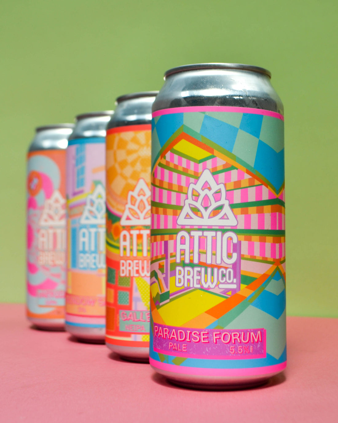
Canning our beer for the first time at the start of the pandemic threw into sharp focus the need for us to be a little more considered with our visuals and how Attic as a whole was presented. Our can designs have gone through many different iterations over the last year and half, each little tweak getting us closer to what we wanted to achieve. The only issue was, we didn’t really know what that was, which I think led us to putting out some pretty wildly different designs over a short period. We all had a feeling about who we were and what we wanted to communicate, but we didn’t have anything concrete.
The eagle-eyed amongst you may have noticed a bit of a change in our most recent designs, however. It may look like a minor update to most, but this time it’s the result of considered and deliberate decisions about who we are and how we present ourselves to the world.
We realised that, first and foremost, we want to show who we are and what we believe Attic beer should be. At our heart, we are a local brewery for local people, brewing approachable, relaxed and fun beers with a strong sense of the city we represent.
We decided on a vibrant, pastel colour palette that is eye catching, but not aggressively so. The designs are intentionally gender neutral, (because beer isn’t just for middle-aged blokes in a dark pub) and are designed to be just as appealing to casual drinkers who just love a good beer with their mates as they are to the nerdiest of craft beer drinkers (you know who you are).
We try to bring in little bits of fun on every label, because at the end of the day that’s why we drink craft beer; they’re much more fun and much more exciting than the mass produced beers we're used to from massive conglomerates. That might be in the form of the description on the can backs (as the author of most of these, I’ll admit to having gone a little rogue recently, but it makes me laugh at least), warning stickers on the labels or little easter eggs on the cans or in the names.
Birmingham features heavily, too. Through our beer names and imagery, we want to show off this city and its burgeoning beer scene. We’re proud to call Birmingham our home and to have Brummies as our customers.
Forward is the motto of our city and we brew Forward Thinking Beer for forward thinking drinkers.
Continued thanks and respect should be showered on our designer, Piarais, for his work in helping us to develop the brand and for all his work on visuals.